Friday, May 29, 2009

Untraveled Roads

Here's another Sarah Kay image colored with Copics. I was fortunate enough to be able to buy about 10 of her stamps from an acquaintance. She wasn't using them and offered them to me at about half price. Some had been used a time or to, but if you are a stamper, you know that doesn't matter. What matters is the quality of the stamped image, which is perfect.

I coupled this image with a sentiment from Rubbernecker about untraveled roads. I think it will make a great card for someone just starting a new phase in their life, especially a young girl.


The DSP is by Melissa Francis stamped with Chocolate Chip Classic Ink and a flourish by Inkadinkado. The black gingham paper is old, old Creative Memories paper. I took my Creamy Caramel stamp pad and lightly sponged the color onto the black and white gingham until it was almost a perfect match for the black and tan gingham ribbon. The paper flowers were made out of the gingham and Melissa Francis DSP. The brads are from the SU Vanilla hardware set and I colored them with the Close to Cocoa marker. When the ink had dried, I polished off the excess. The completed panels were mounted on SU Kraft cardstock.

I thought the Martha Stewart picket fence edge punch was perfect for this card. In my stash, I found a flower charm that matched up well with the DSP. The charm is from Petals A Plenty. Michael's had them on sale over Memorial Day weekend, two cards of charms for $6.

You can see that the inside of the card is finished off using the same papers and color scheme as the front. The sentiment is from Rubbernecker - they have a lot of beautiful sentiment stamps. The brown dotted paper is from the Bella Rose DSP by SU. I also used a CB embossing folder to emboss a row of flowers across the message panel. The small gift box was decorated with more coordinating paper and handmade paper flowers.


MyFreeCopyright.com Registered & Protected

Sunday, May 24, 2009

Dreams


I have always loved this sentiment: "Dreams come a size too big so we can grow into them." from SU's Happy Harmony set. Add the gorgeous paper from the Bella Rose DSP and a sweet Sarah Kay stamp and you
indeed have a dreamy mixture. I sort of reversed my process of starting a card for this piece. Usually I flip through my paper and select a combination. Those colors then influence the colors I use in my stamping. For some reason, I did this the opposite. Maybe because I am new to this type of outline stamp and to using Copic markers, I decided to color the image first. Then I went looking for DSP with red in it and struck the jackpot with the Bella Rose paper pack.

I had a feeling that this little sweetie was dreaming of being an artist so I went hunting for sentiments that would fit. The small charm says "Follow your heart" while the inside sentiment wishes all dreams to come true. From there, I added the butterflies thinking of the transformation from catapiller to butterfly has to be a dream come true. I added a few ribbons, a handmade flower and glittered, embossed die cut butterflies and think this card really is dream come true!

Because my cards are 5.5x5.5" and thick, it is hard to send them in regular envelope so several months ago I started using small boxes instead of envelopes. The boxes provide a great opportunity to continue the theme of the card with decorations on the front plus a label to write the recipient's name. Slide the box into a bubble envelope and it is ready to mail.

Card Recipe:
Stamps: Sarah Kay, Stampin' Up Happy Harmony, Rubbernecker (inside sentiment), On Gossamer Wings
Paper: Whisper White shell, Neenha Solor White for coloring with Copics, Chocolate Chip, Kiwi Kiss, Real Red and Bella Rose DSP.
Ink: Chocolate Chip ink for stamping and Copics for coloring image
Accessories: Various gingham and solid red ribbons, button, brad, jewelry rondell, Cuttlebug, Rectangle, Oval and Mega Rectangle Nestabilities, CB Butterflies die and embossing folders set, red cord from SU, Martha Stewart branch punch, sewing machine


MyFreeCopyright.com Registered & Protected

Friday, May 22, 2009

Your Smile Brightens My Day


Here's a 12x12 scrapbook layout I just finished. I really like making these shabby style layouts. They take me awhile with all the distressing and sponging of the edges. Plus I handmake a lot of my elements rather than using prepackaged chipboard stickers. I spent one entire evening making the paper flowers for this layout. Plus I cut the chipboard letters out with my Cuttlebug. I had originally covered them with a lighter blue floral paper, but I didn't think they popped enough so I cut another set with brown paper and glued it to the original set - that took awhile too!


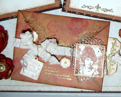
There are two journaling tags peeking out from behind the main photo mat, one was cut with the Mega Rectangle Nestabilities and the other I traced from a template and hand cut. I stamped the flourishes on with Chocolate Chip creaft ink for a nice deep image and then added Kaiser half pearls and soem topaz rhinestones. The paper is K& Co. The brads are plain silver plus a couple of SU rhinestone brads plus some jewelry findings to set them off. I also cut two primatve chipboard hearts with my Cuttlebug and the Hearts & Stamps die and then painted them with Tim Holtz Crackle Paint.
I love making frilly, girly vintage type paper art so this was a joy to work on and I was really pleased with the wayit came out.

MyFreeCopyright.com Registered & Protected

Friday, May 15, 2009

Shabby Chic Criss-Cross Card


For my second challenge card in a three-card series to use techniques that are new to us, I chose doing a criss-cross card. I have long admired them, but hadn't wanted to take the time to learn the technique. So when my card artists' group issued a challenge to use a technique unfamiliar to us, this is one of the three I chose. (This is my first technique challenge using the colorwash faux bleach technique.)

I wanted to to something girly with some sort of lace or trim on the criss-cross section. I chose Melissa Francis DP and matched up the colors in my Copic coloring and the nosegay of Prima roses.

Card Recipe:

Stamps: Whiff of Joy, Inkadinkado, Stampin Up, Papertrey Ink

Ink: Memento Tuxcedo Black, Versamark, Copic markers

Paper: Melissa Francis DP, SU Bashful Blue, Neenah Solar White

Accessories: SU Round Tab Punch, Cuttlebug and Vintage Die (on envelope), trim from Jo-Ann's, K&co. jewel, Prima roses, Stickles, craft foam, scrunched ribbon on front is Chatterbox artsy.licious and on envelope is BasicBasic from Michael's


MyFreeCopyright.com Registered & Protected

Wednesday, May 13, 2009

A Keeper and a New Look

How do you like my new look? I was bored with the way my blog looked so I dove, purchased some elements and re-did it. I am a PhotoShop nubie but struggled my way through it and although it's still a little rough, I am happy with the results. I'll probably be tweaking it over the next week or so.

I hope all you moms had a wonderful Mother's Day and that your family treated you right! I did! I got Copic markers (ok, I'll admit I did engineer that - LOL!) and spent the almost the whole day crafting, sigh, bliss!!
So on Mother's Day, I created this rustic, distressed Father's Day card. It was made with the same set that I made the Sweet Summer Day card with awhile back. It's called Keeper by Artistic Outpost. It's a great set. I hadn't made anything yet with the fishing stamps in the set so I broke them out for Father's Day. All the staming was done with either Vintage Photo or Tea Dye Ranger Inks. The fish were stamped with Versamark and I used three different colors of Ranger Distress embossing powder. If you haven't tried it and like to make distressed work, you need to get some. It is really cool. When you heat it, it doesn't come out smooth and shiny. It stays rough and has a sandpaper feel to it. I punched a tiny hole in the head of each fish and inserted a jump ring which I then threaded through a Tim Holtz Swival Clasp. The screw brads were a little too shiny to go with the aged look of the card so I blackened them with a black Copic marker and then rubbed most of the ink off. The edges were all scissor distressed and sponged with SU Creamy Caramel and Vintage Photo. The brown "wood" panel was stamped first with the SU Weathered background stamp and then run through the Distressed Strips CB embossing folder. I think it turned out to be one great Father's Day card. What do you think?


Card Recipe
Stamps: Keeper by Artistic Outpost, inside sentiment Stampin' Up
Paper: Base is SU Naturals Ivory, Creamy Caramel, Chocolate Chip and last year's SU Apple Cider DSP
Ink: Ranger Tea Dye and Vintage Photo, SU Creamy Caramel & Chocolate Chip, Versamark
Accessories: Cuttlebug and Distressed Stripes embossing folder, Ranger Distress Embossing Powder in Peeled Paint, Vintage Photo and Weathered Wood, screw brads, Tim Holtz Swival Clasp, SU Word Window punch, sewing machine

MyFreeCopyright.com Registered & Protected

Friday, May 8, 2009

Vintage Letter

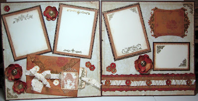
I've decided to expand my horizons and do a few 12x12 scrapbook layouts occasionally. I used to be a big-time scrapbooker. In fact, I was a Creative Memories consultant for over 10 years. But I got sort of burned out on scrapping and went over to card making about a year ago. I love rubber stamping and making cards, but sometimes I just want a bigger "canvas" to work on. So I decided to combine stamping and scrapping. (LOL - another thing I said I would never do - add that to the fact that I said I would never be a blogger and that I would never SEW on my cards - eating my words AGAIN!). So in my seemingly endless quest to make beautiful paper art, here is my first set of 12x12 scrapbook pages in my funky junky shabby chic style. I learned one thing in this endeavor - it's really hard to take quality photos of a two page 12x12 layout. I'm going to have to practice on that. The photos really don't do the pages justice. They are SOOO pretty IRL!!

I started out by making the photo mats - triple layered. The first layer in Chocolate Chip is gold embossed with a script stamp. The next layer up is Creamy Caramel and is clear embossed in a flourish pattern (Baroque Motifs), not that you can really see either stamping, but it adds some texture and interest to the elements. The edges were distressed with scissors and sponged with Creamy Caramel ink. The top layer of all the mats is Very Vanilla and each one is stamped and gold embossed with a different vintage/toile type of stamp plus I added some paper piercing to one mat. The stitching is done in gold thread - did you know that gold thread is $15.99 a spool??? I almost had heart failure at the checkout register at Jo-Ann's earlier this week! Luckily I had a 40% off coupon but it was still $10! But I digress...the top right element is a new Spellbinders frame die that you can also use as a stencil so I stenciled with Versamark and then gold embossed that too.


Then I cut and matted a 12" strip. On the bottom strip I gold embossed a beautiful filigree pattern and then trimmed along the edge for a variegated type of effect and sponged the edge with Tim Holtz Vintage Photo distress ink. I added a pretty strip of crinkly ribbon and hand sewed a V pattern in gold cord. I topped it off with tiny little paper flowers that I punched with a CM flower punch. I spritzed all the paper I made the flowers out of with Tim Holtz gold alcohol ink for a golden shimmer before I punched them out. The large paper flowers were made with my CM heart maker by punching four hearts of two sizes each and fastening them together with a brad or glue. The centers of the largest flowers are gold buttons. I thought they were plastic when I bought them but was unable to snip off the shank so I had to pound it off with a hammer.

The main embellishment is a handmade letter, folded, embossed, distressed and stitched. I stamped a sentiment on it in gold that says "The world is but a canvas to our imaginations" - Henry David Thoreau. I used more of that pretty ribbon, added a stamped vintage tag and a stamped "photo" of a young woman, a piece of gold net and then made a vintage tag to slide under it that is for journaling.


MyFreeCopyright.com Registered & Protected

Sunday, May 3, 2009

Baroque Beauty


I've had a super busy week since my last post and have only managed to get one card done this week. I had agreed to teach a class for our diocese on Catholic Social Teaching so I spent most of the week preparing for it. The class was Thursday night so Friday night I was able to get back to stamping.
I made this card for a challenge with a card artists blog I belong to. The challenge was to go to SplitcoastStampers and select a technique that we had never done before and make a card using it. The theme of the card was to be "Thinking of You". We could enter up to three cards using a different technique each time. So I have entered three cards. This is the first of three and it uses a technique called Color Wash Faux Bleach. The center two square panels are done using this technique, as is the top inside panel. The bottom layer is SU's Old Olive cardstock. I stamped it in Always Artichoke using a Jen Wilson Laundry Line stamp and then overstamped it with in Old Olive and Versamark using a SU Garden Silhouettes stamp and then embossed with clear EP. The next panel up was made using Sherry Cheever's Ink Watercolored Paper technique. The colors I used were SU's Tempting Turquoise and Old Olive. They actually matched perfectly with the Ranger Butterscotch and Steam alcohol inks that I used for the faux bleach technique.
I made the flower by spraying Whisper White paper with the alcohol inks thinned with the blending solution and then punched them out with my old Creative Memories heart maker. I punched four hearts of each size, crumpled them up, punched a hole in the tip end of each and fastened them together with a bead cap and SU brad.

The fragment charm was also made using one of Sherry Cheever's techniques. I think trying to replicate her charm is what got me going on this whole alcohol ink tangent. Luckly Jo-Ann's had all of these products on sale at 50% off last week - what an enabler that was - LOL!!!
Card Recipe:
Stamps: Garden Silhouettes, Laundry Line, Inkadinkado. Wishes Awash
Ink: Adirondak Alcohol Ink Butterscotch and Stream, SU Always Artichoke and Tempting Turquoise, Superior India Ink
Cardstock: Whisper White, Old Olive, SU Glossy White
Accessories: Fiskars Corner Punch, Creative Memories Heart Maker, Tim Holtz Fragment charm, Bead end cap, SU brad, clear embossing powder, white rick rack, silver heart charm, sewing machine

MyFreeCopyright.com Registered & Protected
Blog Widget by LinkWithin


I changed my font at thecutestblogontheblock.com