Sunday, April 26, 2009

Which Way to the Beach?


Watch out! Molly Moose is on the loose. Isn't she adorable? She's all ready for a beach day with her inner tube, sunglasses, beach blanket and "umbrella" drink. I made this card for SC225 at SplitcoastStampers and it's perfect for the OCC color challenge this week too. For OCC we are to make a card in our favorite color combination. I paired up the great beachy colors of SU's Pretty in Pink, Tempting Turquoise and Certainly Celery with Basic Grey's Euphoria DSP. This is also my first ever image colored with Copic markers. I finally broke down and bought a set on sale a few weeks ago and have been practicing with them.

I stamped the cute flip flops on the Basic Grey paper and then double stamped the flowers on vellum, colored the back side with SU markers to coordinate with the paper, trimmed them out and then brushed them with a mixture of a few drops of LuminArt's Simple Solutions (acrylic medium) and a sprinkle of LuminArte's Metallic Mica Luster Pearl. It makes a shinny mixture that you can paint on to give a bit of shimmer. I used it on both the flowers on the flip flops and the hibiscus.


For the inside panel, I stamped the flip flops on the Euphoria paper and trimmed them out, again making the flowers out of vellum as I did for the front. I think this is such a cute stamp from Obsession Impressions.

Because I sell my cards, I have to put the copyright information on the back as required by the companies' angel policies. So I have been prettying up this requirement on my cards. I did this one by making a die cut with the Mega Rectangle Nestabilities and overstamping it with the hibiscus stamp in Tempting Turquoise. I thought it added nicely to the beachy feel of the piece.


Card Recipe:
Stamps: Moose stamp - The Peddler's Pack, Hibiscus - Stampendous!, Flip Flops - Impression Obsession, Stampin' p! Priceless
Cardstock/Paper: Vellum, Tempting Turquoise, Pretty in Pink, Certainly Celery, Neenah Solar White, Basic Grey Euphoria DSP
Ink: Stewart Superior India Ink, Copic markers, Tempting Turquoise and Pink Passion SU markers for coloring the vellum
Accessories: Cuttlebug, Tiny Bubbles embossing folder, Spellbinder Curved Rectangle Mega Nestabilities, Stickles, LuminArt's Simple Solutions (acrylic medium), LuminArte's Metallic Mica Luster Pearl, Starfish charm - K&Co. Seaglass Collection
Have a beachy week!

Thursday, April 23, 2009

Woohoo, I've been published...well, sort of...

I sent photos of my Country Roads and Summer Days (see Art or Trash from March) collages to the stamp maker Artistic Outpost and they published my work on their blog!!! Check it out and maybe leave a comment about my work on their blog.

Wednesday, April 22, 2009

Country Roads


I'm taking a chance here, going in a bit of a new direction. This is not a card and not a scrapbook page. I guess it could be a combination of some of the elements of both. It's done on a 12x12" cardstock paper so in that respect, it is similar to a scrapbook page, but it is not set up to add photos to or to journal on. My thought was that it could be used as wall art, either put in a 12x12 shadowbox frame or otherwise framed/hung. A paper artists' group I am part of had a challenge this week. We were to make something "green" in celebration of Earth Day. It could literally be green or could be a green theme or could just use recycled, repurposed materials. Well, I had this Lucky Brand tag that I thought was cool (I snagged it off a pair of jeans my daughter bought while she was home from college over the Christmas break). Plus I had a pair of jean shorts that don't fit that I have been cutting bits and pieces off for various projects. So the jeans theme popped into my head. Plus I had this awesome stamp set from Artistic Outpost called Home that hadn't seen ink yet. So I was off and running. But I had so many ideas of what I wanted to include that I just couldn't fit everything on a 5.5x5.5" card. I simply needed a bigger "canvas". So I went to the 12x12 scrapbook size paper and it was the perfect size.
What else is recycled? I cut up a blue and white bandana left over from Caitlin's girl scout camping days and found some country look fabric in a box at the back of the closet - must be 30 years old if it is a day! I cut them into small squares and quilted them together with my machine to create the strip running up through the center. I also ripped off strips to hold two little silver charms that say "follow your heart" and "laugh often". There is a button and a silver washer I dug out of a drawer, a piece of denim I cut with the Sizzex Top Note die. Oh, and the natural crochet thread is from my Grandmother's sewing basket that I inherited when she passed away 15 years ago. I have no idea how old it actually is.
So, while this piece is not a card, there is plenty of stamping and other cardmaking techniques used here...and it's certainly funky!!
What do you think? Leave me a comment on what you think I could do with this piece of "art".
Happy Earth Day!

MyFreeCopyright.com Registered & Protected

Friday, April 17, 2009

A Confirmation Keepsake

A friend from my church asked me to make a special keepsake card for her daughter's confirmation. This is what I came up with. I don't have a special stamp set for confirmations and didn't seem to have just the right cross set either, so I made a cross out of this Spellbinder Frameability by cutting one of the frames in half and adding extension pieces. The break is covered by the prayer. The only die that seemed to fit right over the break left too much white space at the top and bottom so I added the piercing swirls which I thought went well with the theme. If you remember, on Pentacost, when the diciples were in the Upper Room, there came a strong wind that was the Holy Spirit. I also used red and a dove, two other symbols of the Holy Spirit. Since it is for a young girl, I wanted to keep it fairly simple so I used the CB Swiss Dots embossing folder. I made up the prayer and printed it on my computer. On the back, I will also put the daughter's name and confirmation date so it will be personalized. I'm not sure if you can see it, but the lower inside panel, white on white, is dry embossed with a CB folder. At the top it says "with love" and at the bottom is a row of daisys. My friend LOVED the card.

Card Recipe:
Stamps: SU Peace Be Unto You, Elegant Inspirations
Paper: Whisper White, Real Red
Ink: Creamy Carmel, Stewart Superior India Ink
Accessories: Spellbinders Framabilities and Pirecabilities, Fiskars corner punch, sewing machine


Tuesday, April 14, 2009

Key to My Heart

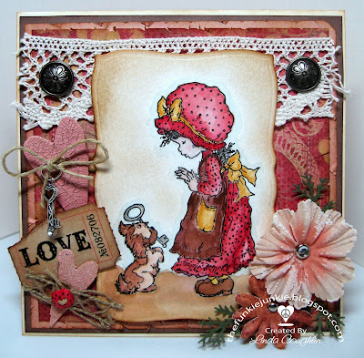
This sweet little girl and doggie is my first Sarah Kay image. I loved watercoloring it with my SU reinkers and making it in the Shabby Chic style. The paper is a pretty design from the K&Co. Classics box. (Such a deal at Michael's last week - a 150 sheet box for $14.99 and the prints are beautiful!!). I decided to make the theme 'key to my heart' by adding a couple of chipboard hearts that I painted with Tim Holtz distress crackle paint. The paint color is actually Picket Fence (white) but I scooped a little out onto a pallet and added a tiny drop of SU Rose Romance reinker plus a dash of Creamy Caramel to bring it down a tone. It came out a pretty good match for the rose color in the paper. The 'Love' and 'Trust' tickets are by Tim Holtz also. I happened to have a tiny silver key in my stash that is so pretty and has a tiny clear rhinestone at the end. The edges of all the papers were sponged with Creamy Caramel and distressed with scissors. The wide lace on top is from Jo-Ann's and the burlap lace is from Stamper's Dream. The raspberry polka dotted button is from Stampin' Up which I colored with a Copic marker and added the black polka dots. It actually matches the dots in her dress and cap almost perfectly. This card was a joy to make. I just loved working with the colors and textures of the design elements. I even decorated the back panel.

Don't forget, to see the details close up, just click on the picture and it will open in your full screen.

Card Recipe:
Stamps: Sarah Kay by Stampavie, SU Seaside Sketches (for the sentiment)
Paper: K&Co., SU: Very Vanilla, Close to Cocoa
Ink: SU
Reinkers: Rose Romance, Chocolate Chip, Close to Cocoa, Creamy Caramel, More M
ustard, Soft Sky, Basic Black. Stewart Superior India Ink and a little Encore silver metallic for the key
Accessories: Brads and lace - JoAnn's, Prima flowers, Cuttlebug Hearts & Stamps die for the chipboard hearts, Tim Holtz distress crackle paint, Nestabilities Curved Rectangles, Martha Stewart
leaf punch, SU button and Copic marker, Tim Holtz tickets, key - who knows - some kind of jewelry finding, burlap lace - May Arts.


MyFreeCopyright.com Registered & Protected

Sunday, April 12, 2009

Blog Candy Winner

The winner of the blog candy for the 6x6 photo tagging is Wendy AKA Louby Loo http://creationsbyloubyloo.blogspot.com!! Thanks Wendy for entering. I'll get your prize right out to you!!

Thursday, April 9, 2009

Tagged and Happy Easter Blog Candy!

I'm feeling a little down today so I decided to join in a fun tag game. Susana at Card of the Week tagged her subscribers to post the 6th picture in the 6th photo file on their hard drive. So here is mine.

Well, it was the luck of the draw, but it sort of shows me as one-sided. While others have pix of family, pets or friends, I opened my photo file and it was picutres of CARDS! And recent cards at that. I did something weird to my hard drive a few months ago and it opened up a new administrator's file. So my photo file only has pictures of the past several months. But it is fun to see others' random photos and I'll be tagging others to play along.

If I have tagged you or if you want to play along, post your link under the comments so we can all see your 6th file/6th picture. I'm offering a mini-blog candy prize. Please number your post and I'll use a random number generator to award this pretty stamp set from K&Co. on Easter Day.


A Mother's Love

As Mother's Day approaches, I plan on doing several Mother's Day cards. This is one I made for a challenge contest for a cardseller's group I am part of. The level of work in this comptition is very high so I was trying to come up with something really special. After a couple of false starts, this is what developed. I was happy with the result. The idea that popped into my head when I first read the contest guidelines is not what you see here. I had something extremely simple in mind, but my love of embellishments wouldn't let me leave it quite that simple. I wanted a lot of white with a pretty contrast. As I leafed through my paper stash, I found one sheet of this Basic Grey paper which matched very nicely to last year's SU In Color Purely Pomegranate. It made a nice contrast with the crisp white paper I used. The frame is cut with a new Nesties set Labels 4. I double layered it for strength. The second layer is very thin white cardboard (came in an SU paper pack). The saying is stamped on acetate, mounted on the back of the frame which is popped up on craft foam. Then I struggled over whether to add the flowers. The contest guidelines said no bling, keep it simple. In the end, I gave in and added the flowers. I think they were the finishing touch - we'll see what the judge thinks!
The heart on the inside was cut with my Creative Memories cutting system. The frame inside was made the same as the outer one. I like the popped up window-type look, but the card does not close flat, which might bother some of you. I'm not crazy about cards that don't fold flat, but went with it for this time.
Card Recipe:
Stamps: Morning Soft
Paper: Whisper White, Purely Pomegranate, Basic Grey DSP
Ink: Stewart Superior India Ink
Accessories: Cuttlebug and Swiss Dots embossing folder, Nestabilities Labels 4, Creative Memories cutting system, Martha Stewart border punch, SU Pretties Kit (large half pearls), Michael's generic small half pearls, silk flowers from Jo-Ann's, sewing machine.

Saturday, April 4, 2009

Strawberry Sweetness

Mummm, yumm...think strawberries and chocolate. An amazing confection, candy for the pallet. And this sweet little card I whipped up is definitely a feast for the eyes - eye candy! The beautiful color combination of pinks, coral, celery green and deep chocolate brown are rich fare, drawing the eye back to feast again and again. As happens with many of the cards I photograph, I don't think the camera does it justice. I wanted to make something light and sweet with this week's Splitcoast Stampers' Wednesday Sketch sC222. I recently won a pack of DCWV Nana's Nursery Baby Girl paper in a blog candy give-away on Becca Feeken's wonderful blog Amazing Paper Grace. So I broke it out and decided the strawberry design was perfect for this retired SU set Fairies. SU's Cameo Coral and Certainly Celery were a prefect match as was the silk ribbon and silk flowers I've had hanging around in my stash for some time. A perfect opportunity to get them out and use them. I just love this color combination.

Here's the card recipe:
Stamps: Stampin' Up Fairies
Paper: DCWV Nana's Nursery, SU's Cameo Coral, Certainly Celery, Chocolate Chip, Very Vanilla
Ink: Used for watercoloring: Cameo Coral, Certainly Celery, Barely Banana, Soft Sky, Pale Plum, Encore Ultimate Metallic Silver (on wings), Versamark. For background sponging: Creamy Caramel, Chocolate Chip
Accessories: Cuttlebug, Circle Nestabilities, Labels Four Nestabilities, CB embossing folder D'vine Swirls, Martha Stewart edge punch, Crystal Effects, SU brads, Jewelry Essentials bead caps, sewing machine, silk flowers, stickles, ribbon saved from a Brighton purchase - LOL!


Blog Widget by LinkWithin


I changed my font at thecutestblogontheblock.com